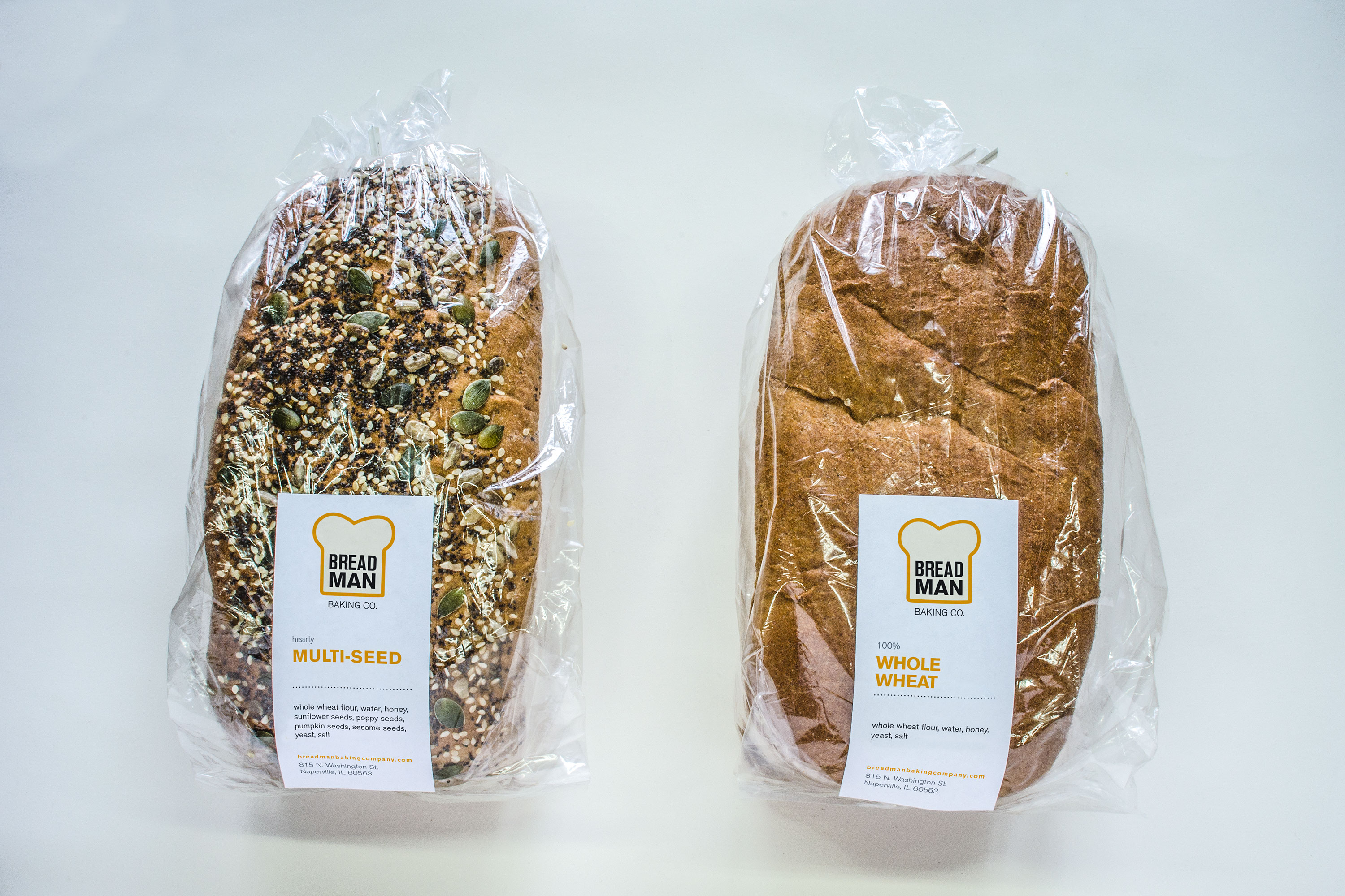
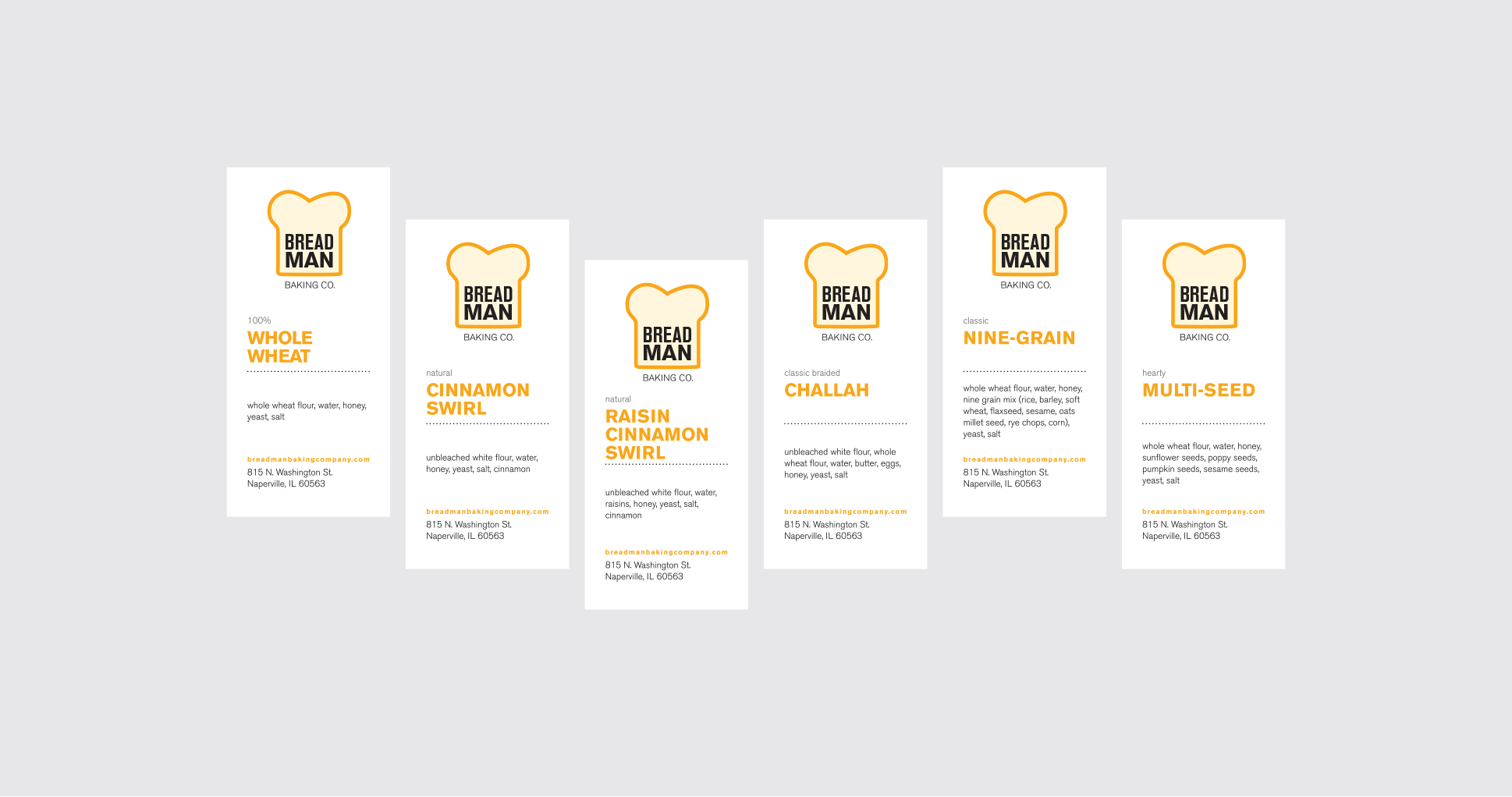
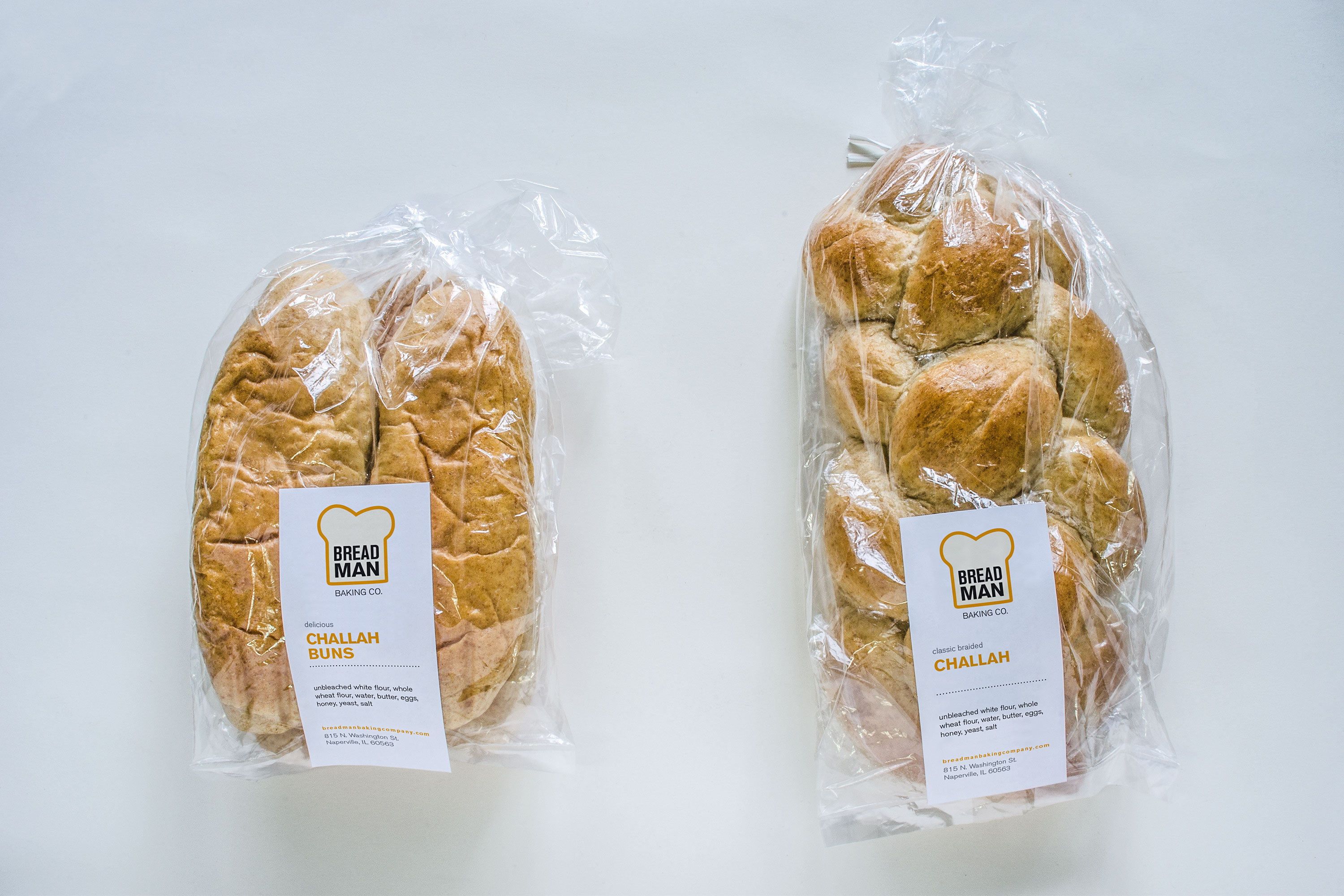
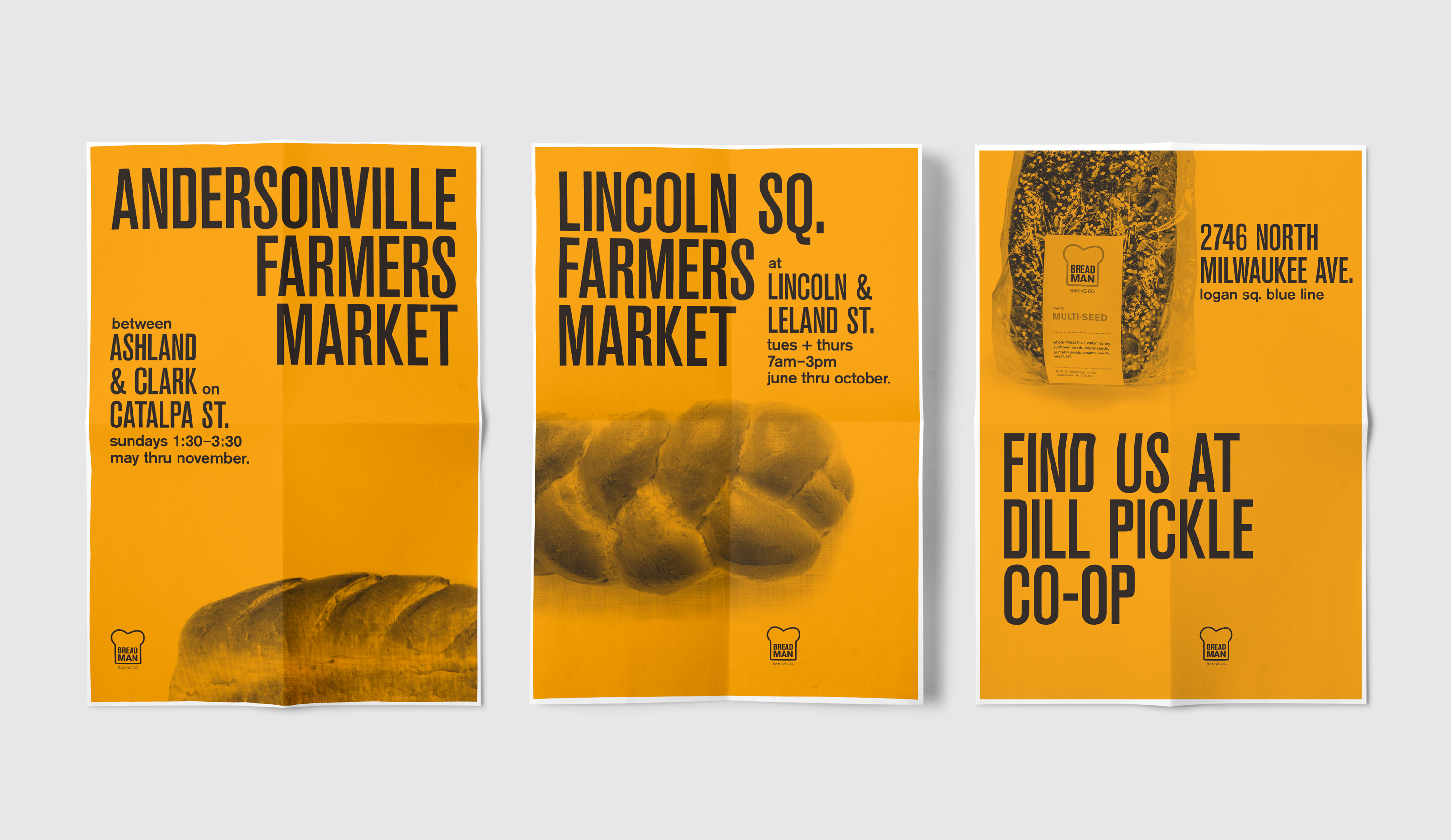
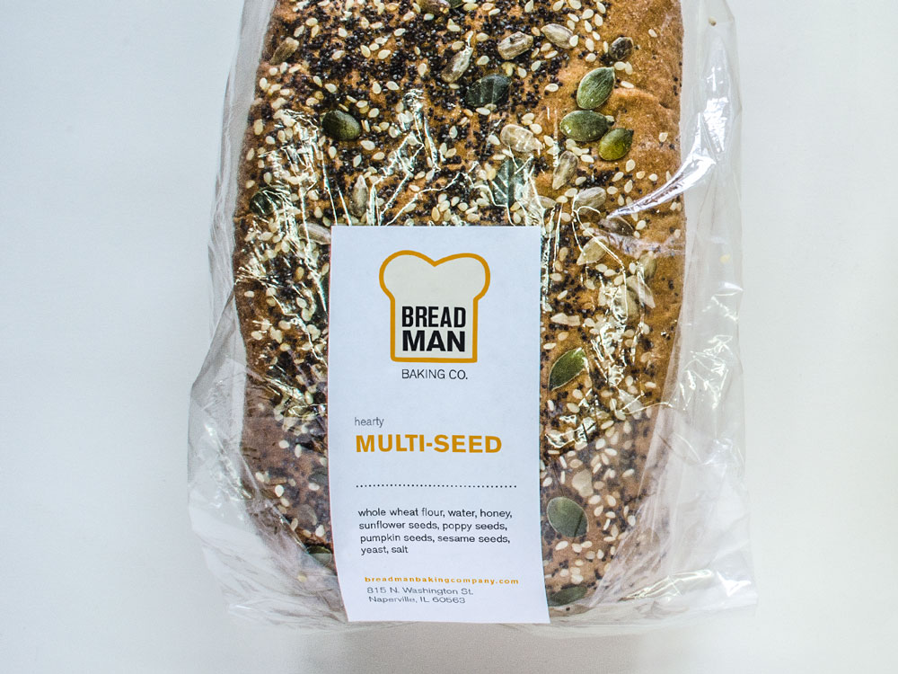
Breadman Baking Co.
Small yet mighty, founded on a family tradition of baking homemade classic breads, cookies, and sweets.
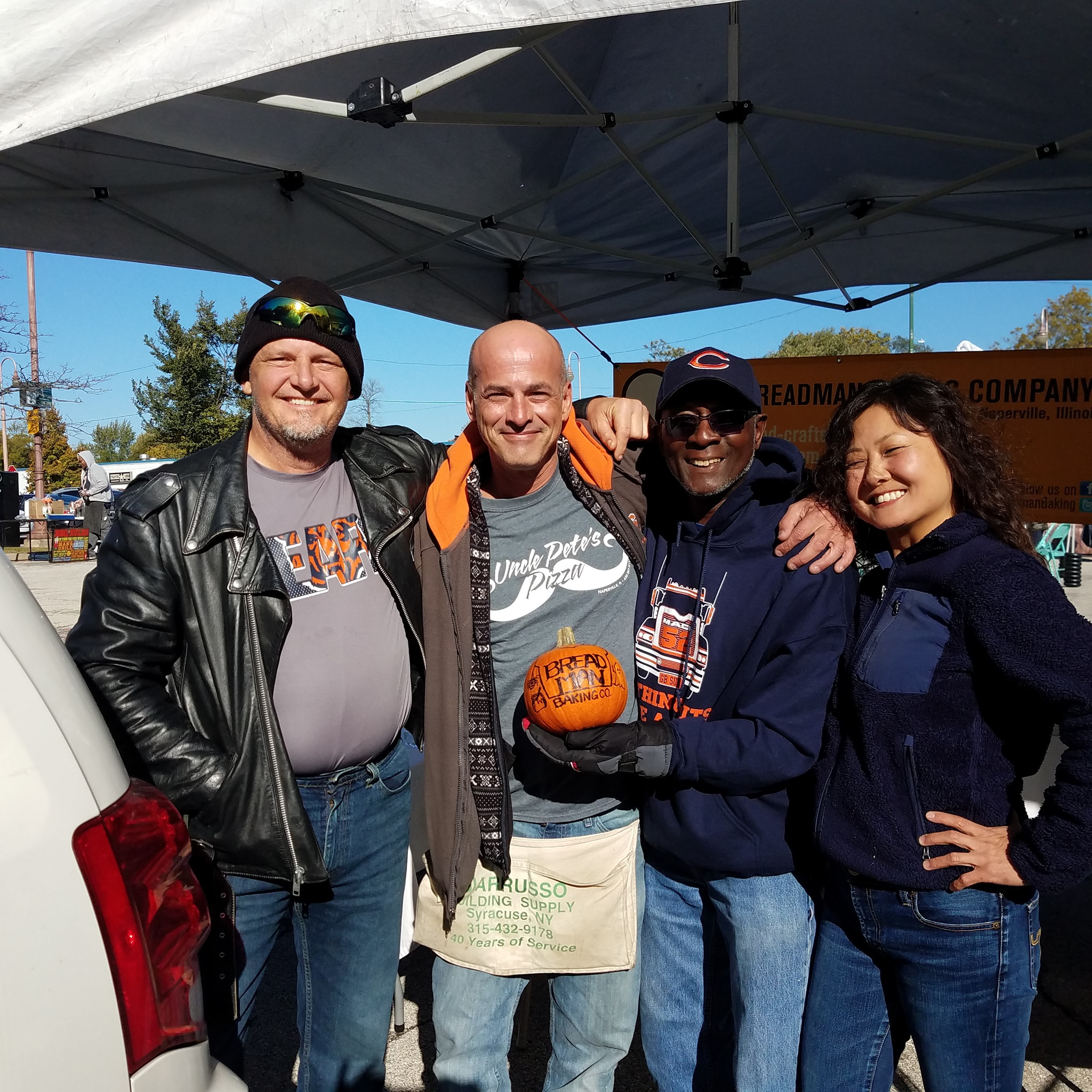
Frank & Crew
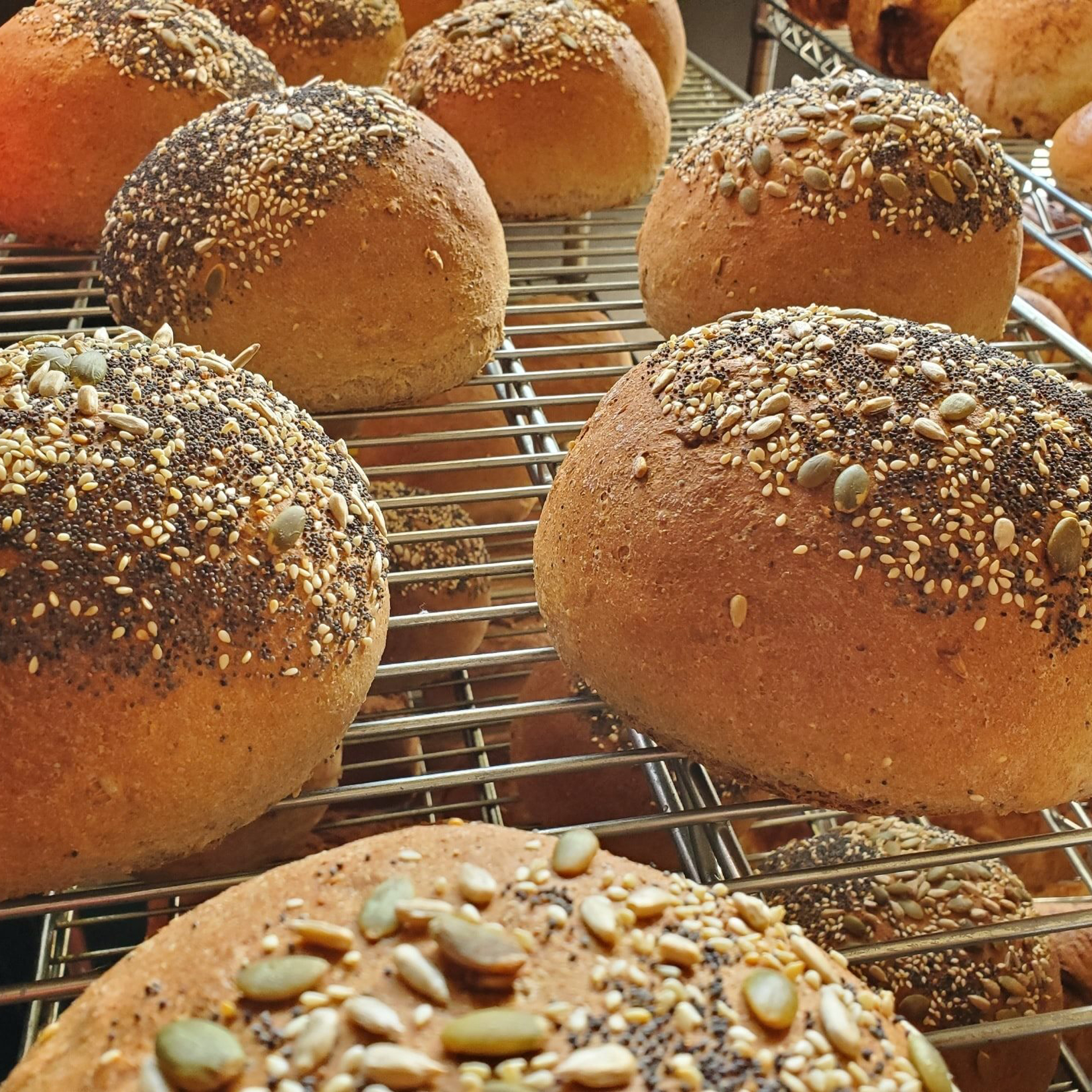
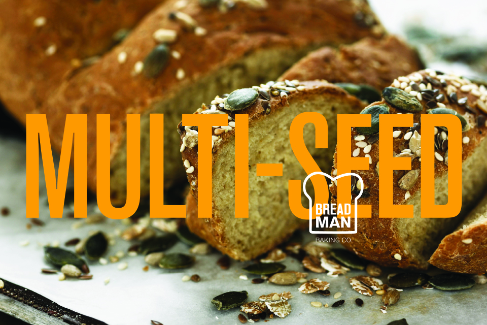
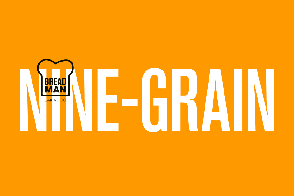
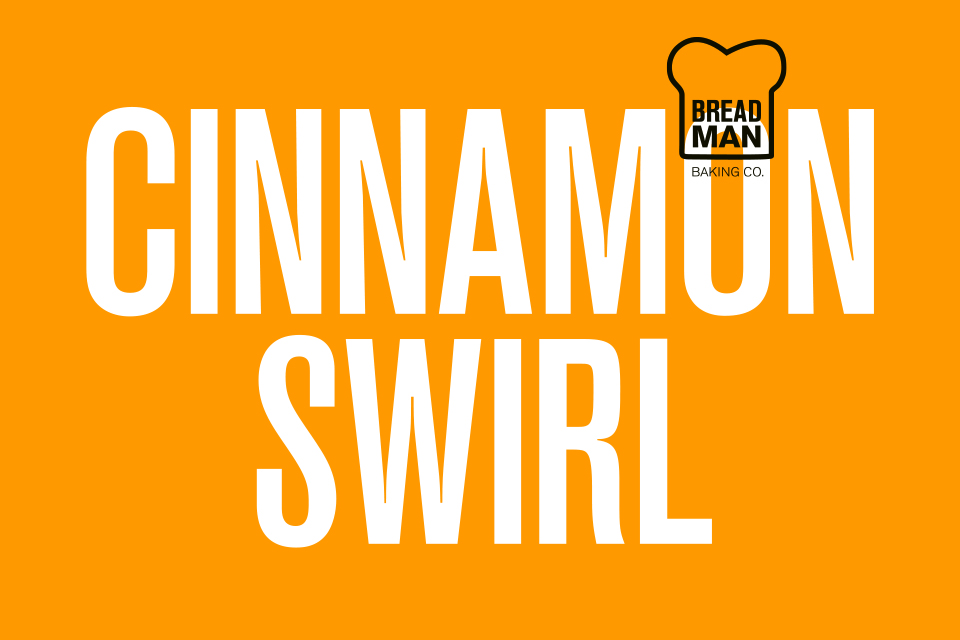
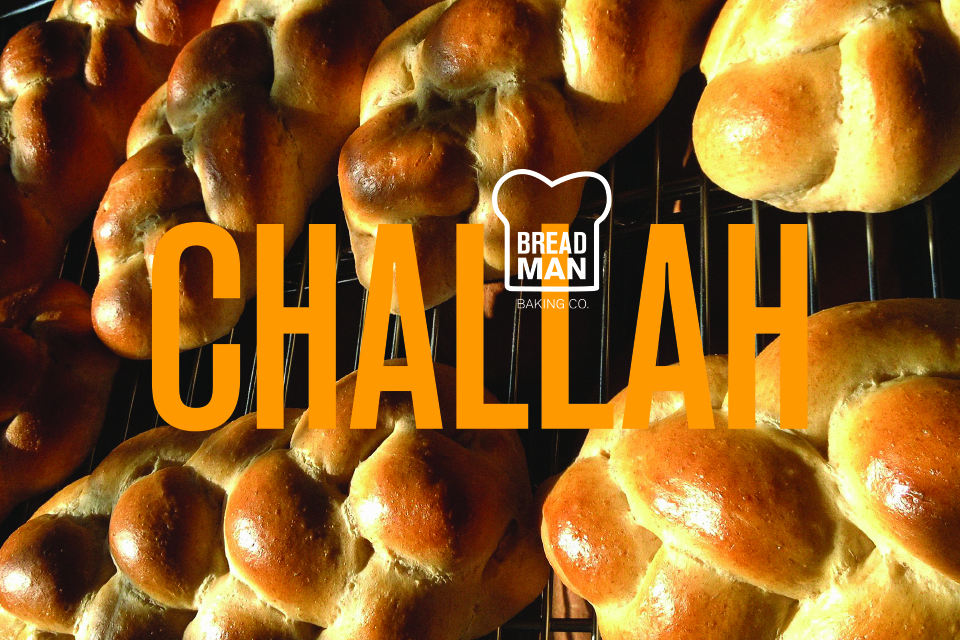
Their bread
The Breadman (Frank) needed help with this endeavor. Something that made him recognizable, but done simply to match how he approaches ingredients. The goal was to not only to continue selling in farmers markets, but to get on shelves at co-ops and specialty markets. So the brand came to form by having just the right amount of disruption in markets, without the stigma of appearing as corporate.