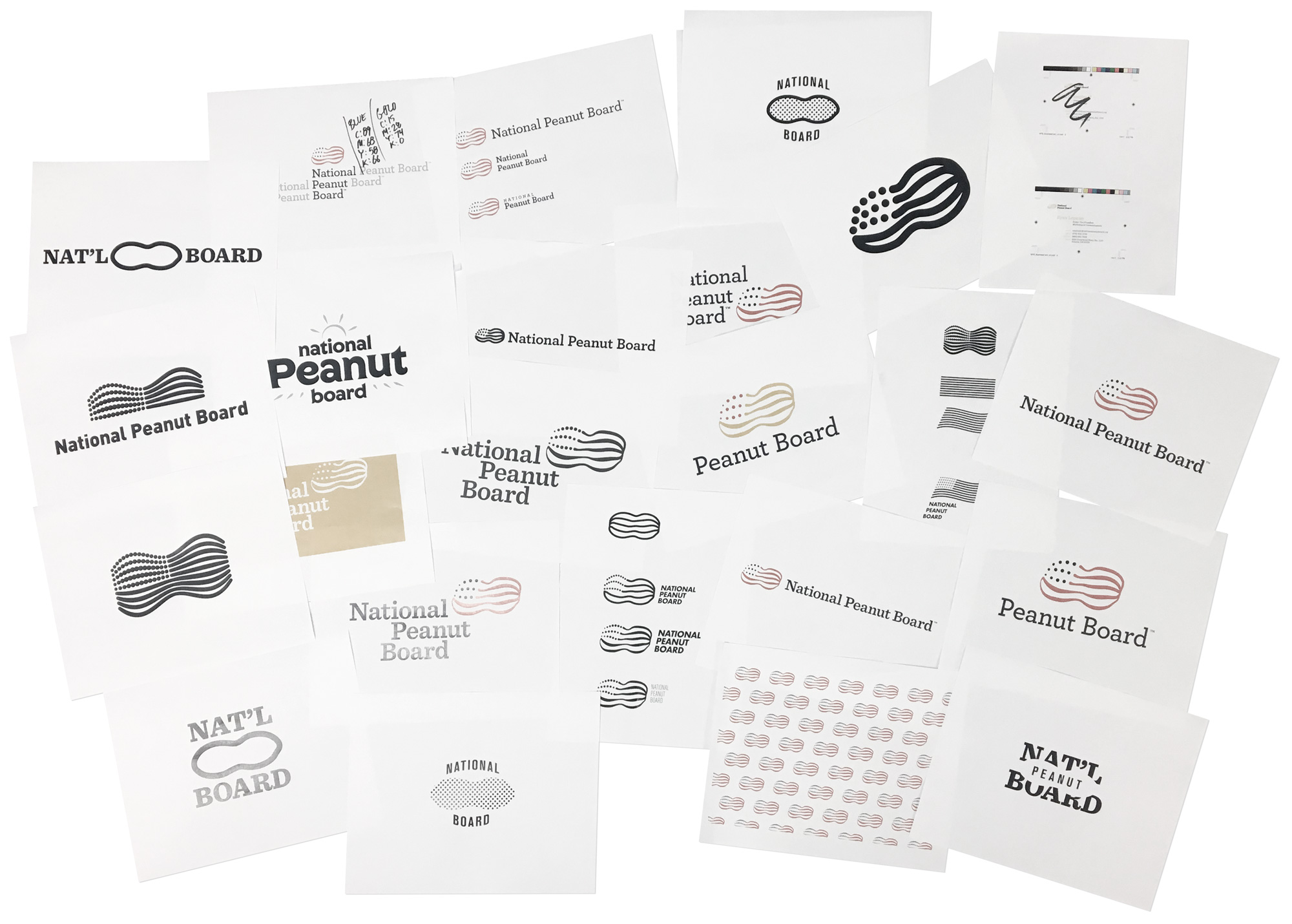


Shortly after changing their marketing strategy, the National Peanut Board was looking to update their brand’s identity. Having prior difficulties with being misperceived as not being real U.S. farmers, to clear some things up from a visual standpoint.
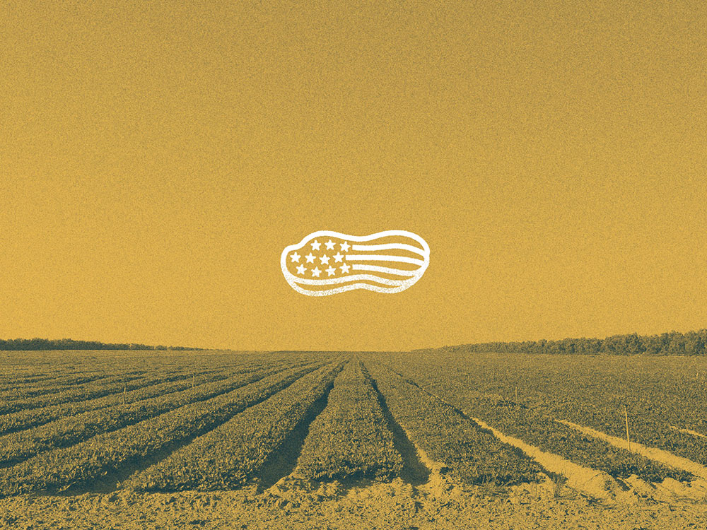
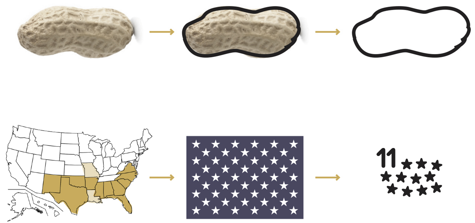
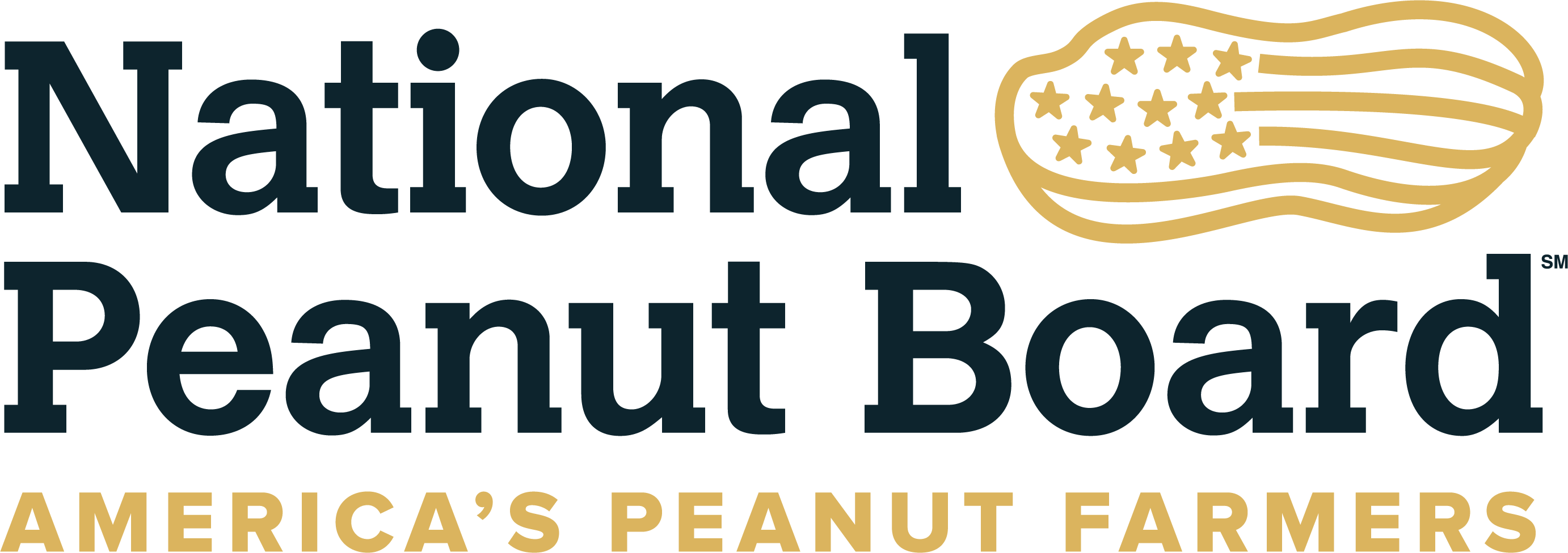
This is where the conception of “America’s Peanut Farmers” has come from. The logomark itself speaks as being proud of the peanut and of the country that grows them. The 11 stars within the logomark signify the states in America’s Peanut Belt where all of the crop is grown.
- Client National Peanut Board
- Discipline Brand Identity, Art Direction
- Year 2017